Published: Jan 14, 2025
From Chrome 133, text-box lets developers and designers tailor the space
above and below text.
Longhand:
text-box-trim: trim-start | trim-end | trim-both | none;
text-box-edge: cap | ex | text | leading + alphabetic | text;
Shorthand:
text-box: trim-both cap alphabetic;
This property lets you control the space above and below text, for example
<h1>, <button> and <p>. Every font produces a different amount of this
block directional space which contributes to the element's size. This chaotic
space contribution is not easily measured, and has been impossible to control,
until now.
The font knows, now CSS knows, too.
The space above and below a font exists because of how the web lays out text, called "half-leading". This is expertly covered in a post by Matthias Ott called The Thing With Leading In CSS. Essentially, when typesetting was done by hand, pieces of metal lead were used to separate lines of text. The web, inspired by leading, splits the lead into two pieces and distributes a piece above and a piece below the content.
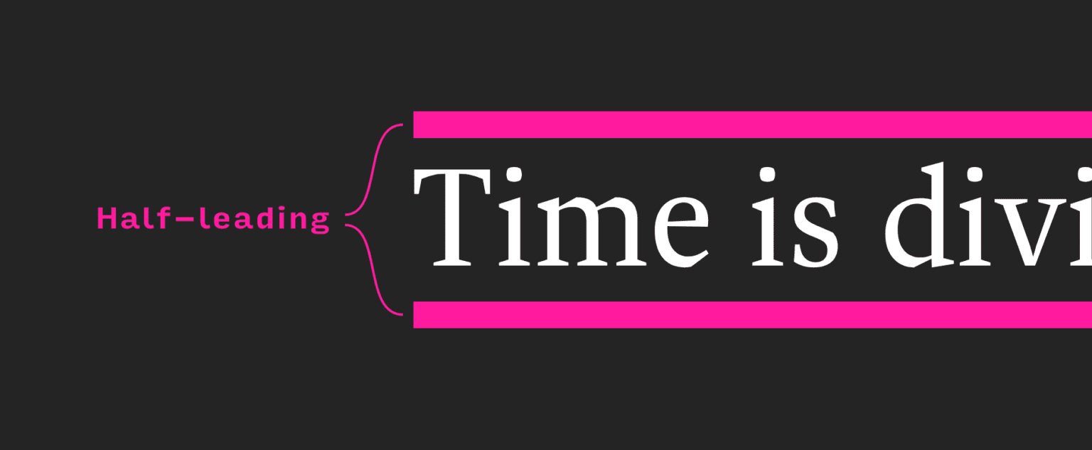
This history is meaningful because, text-box gives us names for each half:
over and under. Plus, the ability to trim it off.
There is prior art to text-box also, you may recall the exciting post from
Ethan Wang called Leading-Trim: The Future Of Digital Typesetting,
where leading-trim (the name text-box previously had) was first introduced.
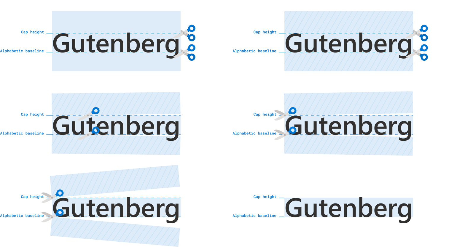
Your entry point into text trimming might be from Figma and its "vertical trim" controls for designers. This X post demonstrates where this vertical trim option is and how it's helpful for buttons.
Regardless of how you got here, this small sounding typography control can make a big difference.
Feature and syntax
Here, in my opinion, are the two most common one-liners you'll need when working
with text-box:
h1 {
  /* trim both sides to the capital letters */
  text-box: trim-both cap alphabetic;

  /* trim both sides to the lowercase letter x */
  text-box: trim-both ex alphabetic;
}
Trimming both to cap alphabetic will be the most common use of this feature.
The following demos use this many times. However, the previous example also
shows ex alphabetic because it's useful for optical balance in its own
unique ways.
Explorer playground
Explore the syntax in our playground, and see results using drop-down menus. You can change fonts, change over and under trim values, and follow along with the color coded visuals and labels.
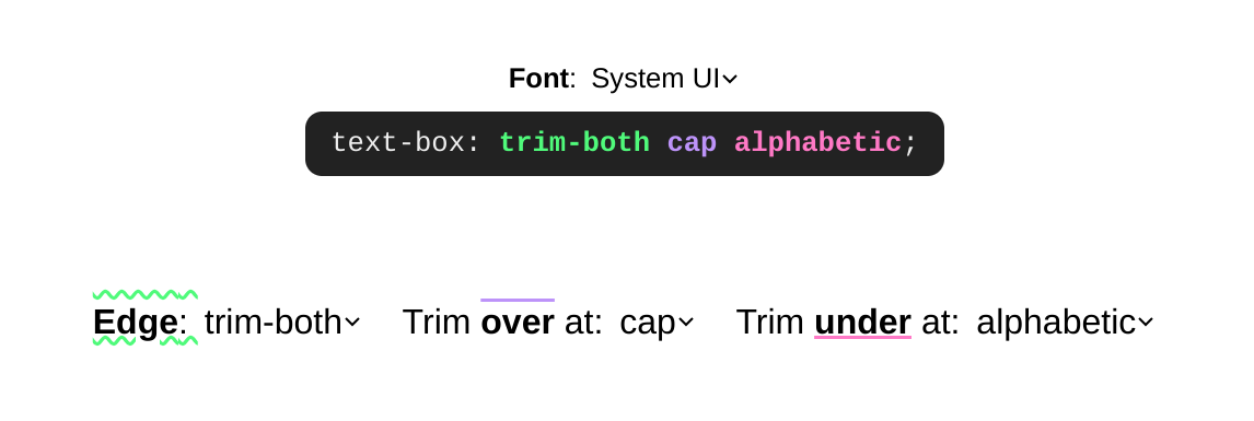
Things to try:
- Visually inspecting how
text-box-trimworks across single line and multi-line text variants. - Hovering over a variant, seeing the trim values used to achieve that effect.
- Changing the font.
- Trimming only one side of a text box.
- Review the syntax as you play.
What can I build and what problems does it solve?
There are some much simpler centering and alignment solutions that emerge from this trim capability. You can even get closer to proper leading, where something like gap can be used between contents.

Easier centering
For smaller, more inline and content intrinsic components, padding: 10px is a reasonable style to specify for an element for equal spacing on all sides. However, the result can confuse people, as it often has extra space on the top and bottom.
To work around this, developers often explicitly putting less padding on the top and bottom (block) to offset the effects of half leading.
button {
  padding-block: 5px;
  padding-inline: 10px;
}
At this point we're left to try value combinations until things are optically centered. This might look good on one screen and operating system, but not on another.
text-box allows us to trim the half leading space from the text, making equal
padding values like 10px useful:
button {
  text-box: trim-both cap alphabetic;
  padding: 10px;
}

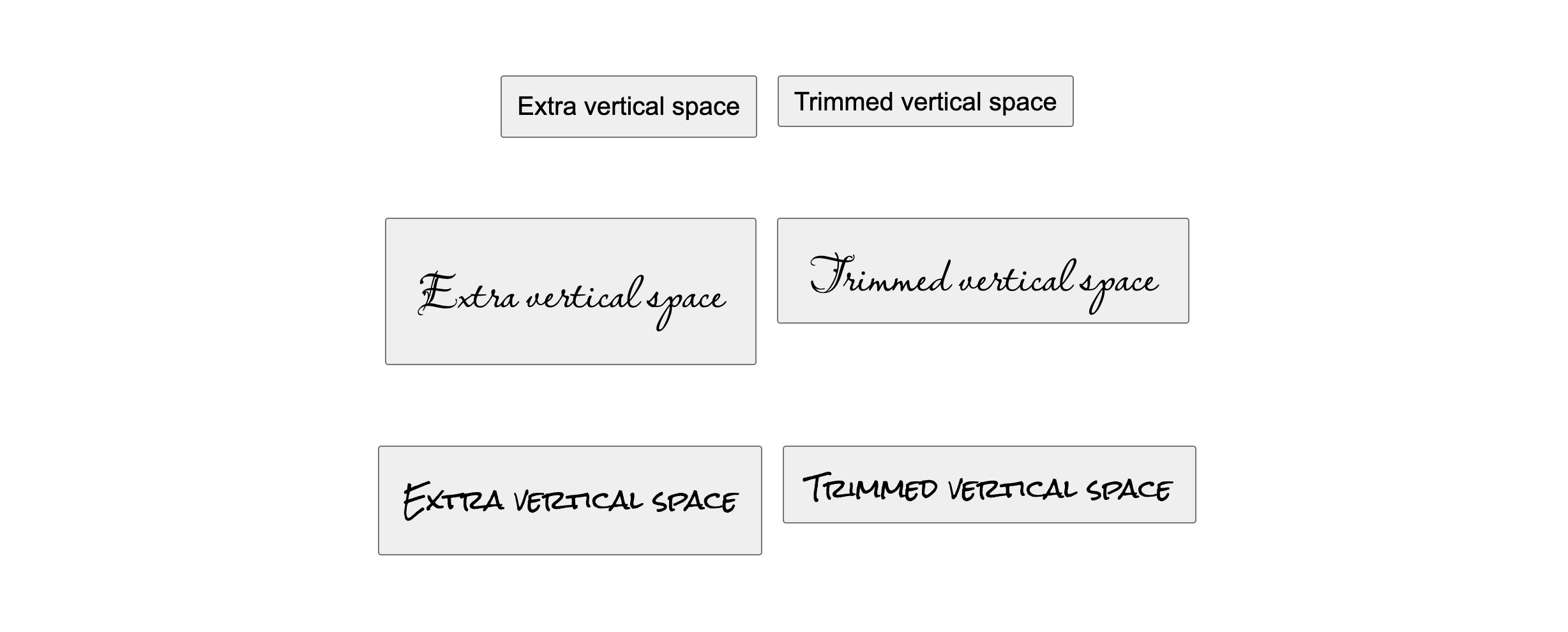
Here are a few <button> elements that show how trimming the space with
text-box makes padding: 10px look equal on all sides in a practical
interactive element. Notice how the alternative font can produce some wildly
different half leading space.
Here are <span> elements, often used to show categories or badges. Another
moment where equal sided padding should be the best solution, but until
text-box we've had to work around it.

Easier alignment
The extra, uncontrollable, half leading space above (over) and below (under)
a text box also makes alignment difficult. The following examples show when half
leading can make alignment difficult and how trimming the block sides of a text
box can create better alignments.
Here an image is placed next to text. The image grows to the height that
the text needs. Without text-box, the image is always a little bit taller.
With text-box, the image can perfectly align with the text content.
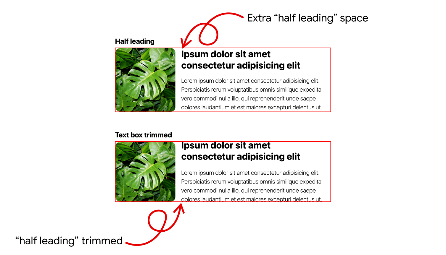
Notice the whitespace is above the first formatted line of text and below the last formatted line of text in scenarios with line wrapping.
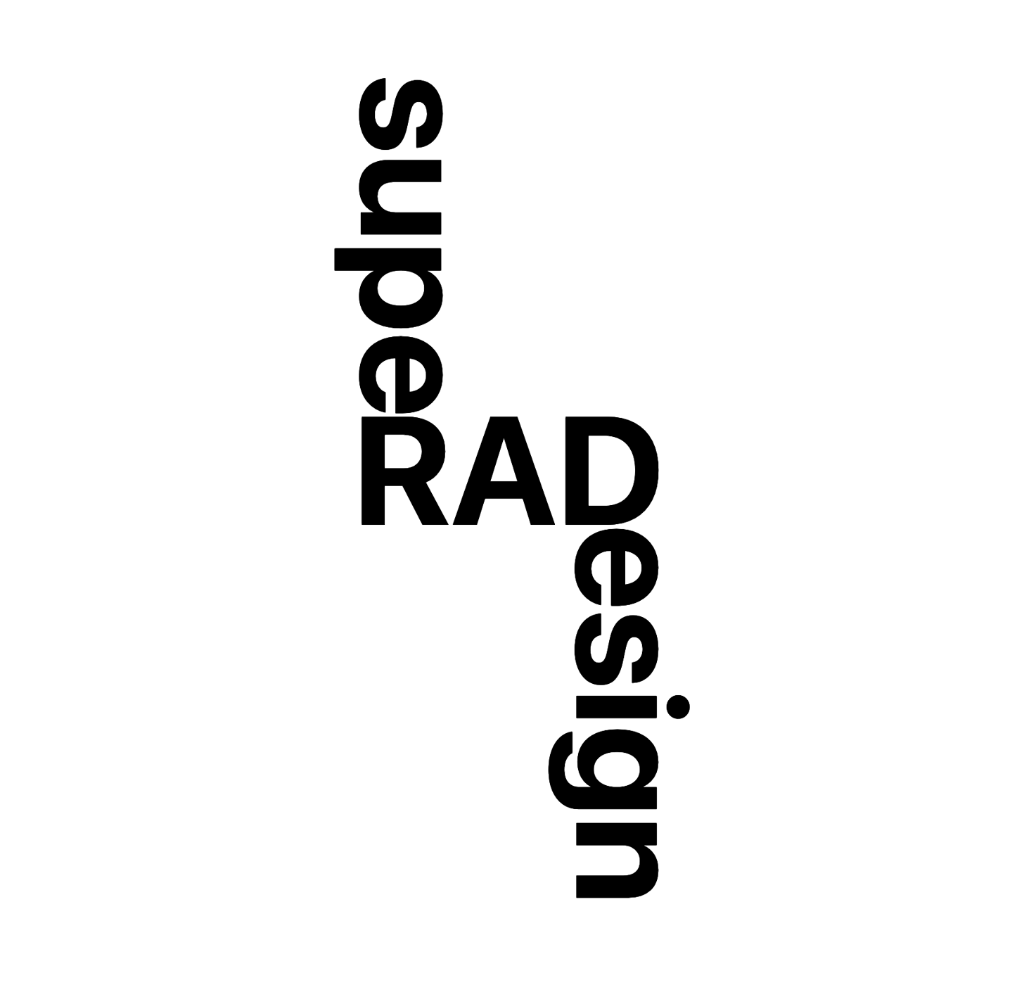
In the following example, notice how the feature
logically adapts to a change in
writing-mode. Try
changing the text, watch how the layout continues to stay aligned.
Continue studying
Want to know more? The following list of links offer various amounts of additional information and use cases.
- Codepen collection of all the demos.
- Great research and demos by Jan Nicklas.
- Two CSS Properties for Trimming Text Box Whitespace on CSS Tricks.
- CSS Inline Layout on text edges.
- Not to be confused with
size-adjustorascent-override - CSS Baseline: The Good, The Bad And The Ugly.
- Applied to many HTML elements: CodePen.
- Safari's blog post.
- Why I'm excited about text-box-trim as a designer.

